🎵 I am a man who walks alone
And when I'm walking a dark road
At night or strolling through the park
When the light begins to change
I sometimes feel a little strange
A little anxious, when it's dark. 🎵
Dark mode seems to be getting more and more popular these days, especially among developers. I'm not generally a fan (no, I'm not afraid) and I generally use light mode everywhere. The one exception is at night in low light - at those times the blinding white of some websites can be very uncomfortable.
It was one of these situations, in the dark, looking something up on my blog that I decided I finally had to do something about the searing light.
Enabling dark mode
If you want to try out dark mode on this blog, click the ☾ Dark link in the header bar:

If you're on mobile, you won't see the words, just the ☾ icon:

Clicking this will invert the colours for the site, switching to (what I hope is) a pleasant dark mode:
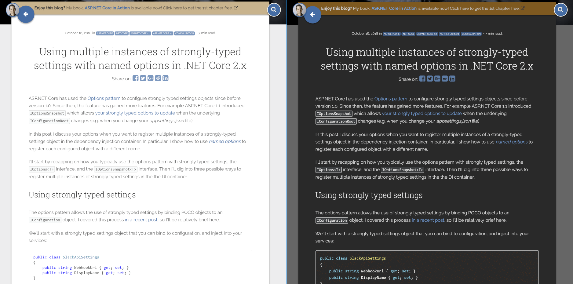
It's not perfect, but it does the job I think!
If you decide it's not for you, you can click ☀ Light to switch back to light mode.
How I enabled dark mode for my blog
The actual mechanism for achieving dark mode is pretty simple. Clicking the ☾ Dark or ☀ Light button does two things:
- It adds a
data-themeattribute to thedocumentElementfor the page - It stores the selected theme (
lightordark) inlocalStoragewith thethemekey
When the blog loads again, it checks localStorage.getItem("theme") to see if you've previously set the theme. If you have, then it adds the data-theme attribute immediately, so your selected theme persists across page loads.
That's all that's required on the JavaScript side. As you would probably expect, most of the effort was around updating the CSS to work with the new theme. Luckily, my blog doesn't use that many different colours, and it uses Sass to make updating the CSS more manageable.
One possible way to create a dark mode is to use CSS variables on the client (which I didn't realise, but are actually very well supported). You can calculate the required colours in the browser by doing a blanket inversion of the site's light-mode colours. I decided against that early on, as initial tests just didn't look that nice.
I maybe should have persisted down that route, they worked well for Marcin Wichary in his post Dark mode in a day.
Instead, I decided to base the colour theme on VS Code's dark mode colours. I went digging around on GitHub for the theme files and liberally pinched hex codes. Generally, the process involved finding everywhere in my .sass files that set a colour, and then creating a more-specific version of the rule, underneath the [data-theme='dark'] selector. For example:
[data-theme='dark'] {
    .post .post-card {
        background: $dark-post-background-color;
    }

    .card .card-content,
    .card .card-footer {
        background: $dark-post-background-color;
    }

    h1, h2, h3, h4, h5, h6 {
        color: $gray-lighter;
    }

    body {
        color: $gray-light;
        background: $gray-darker;
    }
}
After a lot of iterating and adding a dark-mode prism.js theme for code-highlighting, I had my very own dark mode!
Missing features
There's a few things that don't work brilliantly. Most notable are any images in the posts. Your eyes are happily adjusted to the dark, when BAM! whiteness overload:

I'm in two minds about whether to try and do anything about those. Technically speaking, it would be possible to invert the images in the post with a single CSS rule:
[data-theme='dark'] .post-content p img {
    filter: invert(100%);
}
This has pretty good support, but I don't know that it's something that should be applied everywhere. A lot of the images are screenshots, so they wouldn't actually represent what you would see any more. Also, it makes some images look pretty weird and hard to read…

I'm wondering if another button that lets you toggle colour inversion on images is worth it? Is it a big deal? Is it good enough the way it is?
If you feel strongly one way or the other, let me know in the comments, and I'll look into it. Otherwise, enjoy!
Resources
I have to give another shout out to this great article on Medium - Dark theme in a day by Marcin Wichary. In his post he describes how he created a dark theme for a mobile app in a day, using CSS variables. It's a great post, and served as the model for my approach to tackle the problem. He even inverts the images, and gives some techniques to make inverted line diagrams look better, which I may use if I decide to go that route! Either way, a really good read.
The approach I've taken is also heavily inspired by the light / dark toggle in the Microsoft docs menu bar:

I notice they don't try and invert images either. Probably more hassle than it's worth, especially at their scale.
Finally, I'll mention that it's also possible to detect when a user is running MacOS Mojave in dark-mode, and to automatically switch to a dark colour scheme. Frank Krueger added this feature to fuget.org recently. This uses a media-query to detect whether the user is using dark-mode:
@media (prefers-color-scheme: dark) {
    body, .dropdown-menu, ul.dropdown-menu>li>a {
        background-color: #181818;
        color: #ddd;
    }
}
This seems really nice, it's just a shame you can't detect Windows 10 dark mode in this way… I think if you're going to take this route to dark-mode, then using the media query is great for setting the default experience. But it's probably best to provide a manual override to let users to switch between light and dark as whenever they want to.