In this post I show how I managed to draw graphs in GitHub PR comments using Mermaid diagrams!
Background: why draw graphs in GitHub comments?
In our work on the Datadog .NET tracer, we have to be very aware of the performance impact of the tracer on a customer's application. That means:
- We need to be able to estimate the "real world" impact of a feature that affects performance
- We need to be careful not to accidentally introduce performance regressions
- We need to monitor the longer-term performance, so that we don't accidentally a large performance regression through many minor cuts.
We track and monitor these in three many ways:
- Micro-benchmarks using BenchmarkDotNet
- Throughput tests, which hammer a web application with requests, using Crank
- Execution-time tests, which measure the complete time for an app to run, to account for one-off initialization time using timeit.
Obviously we send the results of all these to Datadog, and track the results in dashboards and over time. These are all checked before a release to make sure performance meets our expectations.
However, if you accidentally introduce a performance regression in a PR, it's preferable to get that feedback immediately instead of having to bisect it later on. GitHub PR comments are a great way to do that: they're immediately visible, they don't block merging (performance regressions are sometimes expected and/or acceptable), and they can be posted programmatically from the build pipeline.
Posting comments to GitHub
For some time we have been posting comments on GitHub PRs comparing the code coverage changes:
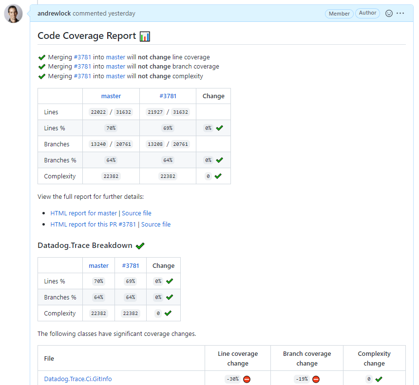
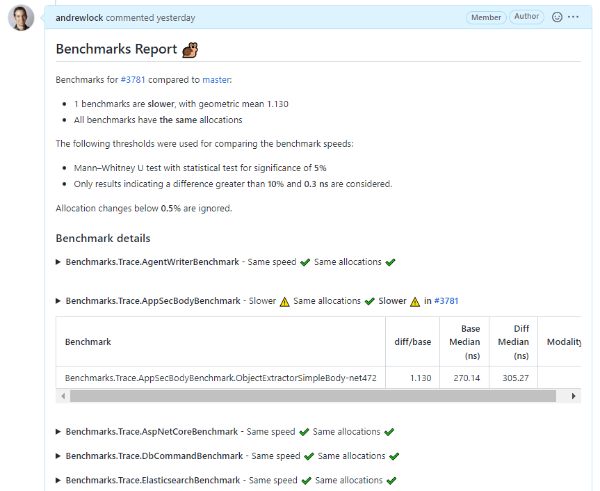
as well as the results of micro-benchmarks, highlighting any statistically significant changes (calculated using the handy Perfolizer library)
We post these results to GitHub directly from our build pipeline (which uses Nuke). The following function uses the GitHub REST API to post the provided markdown as a comment to PR number prNumber, using the provided gitHubToken (which is stored as secret in the build pipeline):
static async Task PostCommentToPullRequest(string gitHubToken, int prNumber, string markdown)
{
    Console.WriteLine("Posting comment to GitHub");

    var httpClient = new HttpClient();
    httpClient.DefaultRequestHeaders.Add("Accept", "application/vnd.github.v3+json");
    httpClient.DefaultRequestHeaders.Add("Authorization", $"token {gitHubToken}");
    httpClient.DefaultRequestHeaders.UserAgent.Add(new(new System.Net.Http.Headers.ProductHeaderValue("nuke-ci-client")));

    var url = $"https://api.github.com/repos/DataDog/dd-trace-dotnet/issues/{prNumber}/comments";
    Console.WriteLine($"Sending request to '{url}'");

    var result = await httpClient.PostAsJsonAsync(url, new { body = markdown });

    if (result.IsSuccessStatusCode)
    {
        Console.WriteLine("Comment posted successfully");
    }
    else
    {
        var response = await result.Content.ReadAsStringAsync();
        Console.WriteLine("Error: " + response);
        result.EnsureSuccessStatusCode();
    }
}
This all works well, and we wanted to do something similar for our throughput tests. But when it came to these tests, we really wanted to show graphs comparing the throughput results between branches. That's what we were used to in Datadog, and we didn't really want to go backwards to tables of numbers; we really wanted to show graphs in the markdown.
The trouble is, generating graphs that could be embedded in the markdown seemed like a pain. I think it would be possible to embed an image by base64 encoding it as an inline data: image, but instead I want for a "simpler" approach: hacking mermaid diagrams.
Mermaid diagrams in GitHub
Github introduced support for Mermaid diagrams last year. To quote the Mermaid project:
Mermaid is a JavaScript-based diagramming and charting tool that uses Markdown-inspired text definitions and a renderer to create and modify complex diagrams
You can embed a mermaid code block into GitHub markdown block, and GitHub will automatically render it as an image using mermaid.js. For example, the following code block:
```mermaid
flowchart LR
    A[Hard] -->|Text| B(Round)
    B --> C{Decision}
    C -->|One| D[Result 1]
    C -->|Two| E[Result 2]
```
Would be rendered as

Mermaid supports a bunch of different types of diagram:
- Sequence diagram
- Flow chart
- Class diagram
- State diagram
- Entity relationship diagram
- User journey
- Pie chart
- Gantt chart
- Mindmap
- Git graph
However, you'll notice that none of these are the bar or line charts that I really wanted. So some imagination was necessary.
Hacking mermaid diagrams to produce bar charts
The revelation I had was with Gantt charts. If you squint, you can sort of see the "bars" we're aiming for in this Gantt chart
```mermaid
gantt
    title A Gantt Diagram
    dateFormat  YYYY-MM-DD
    section Section
    A task           :a1, 2014-01-01, 3d

    section Another
    Task in sec      :2014-01-02  , 1d
    another task      : 2d
```
which renders as

It's not perfect though. In order to use this chart there's a few things we need to "fix"
- Gantt charts work based in dates (you can see dates along the axis). We need to figure out a way to work with raw numbers (i.e. number of requests in throughput tests).
- Similarly the size of the bars is specified in dates. Again, we need to provide dimensionless numbers instead of dates.
- We need to "group" results together. For our throughput tests we run multiple scenarios, and we want to compare between multiple branches for a given scenario.
The solution to the first two points is to use the mermaid diagram's support for specifying time using Unix Epoch (seconds or milliseconds). Our throughput tests give results that are roughly "millions of requests" (i.e. 3-6 million requests), These values are small relative to "typical" Unix Epoch values (e.g. 1,676,197,001) but the important point is they're valid.
To use Unix timestamps in the mermaid Gantt chart, we need to specify two settings:
dateFormat X—this specifies that the value we provide for each Gantt element is specified as a Unix Epoch timestamp (s)axisFormat %s—this is the d3-time-format format stringfor Unix Epoch timestamp so that we display the raw values on the axis.
That's the format issues resolved. The grouping issue is relatively easy using the support for "sections"
- Each scenario is placed in its own
section. - Each
sectioncontains the results for the candidate branch (the PR), themasterbranch, and some existing "benchmark" branches. These are displayed in the same order in each section, for easy comparison.
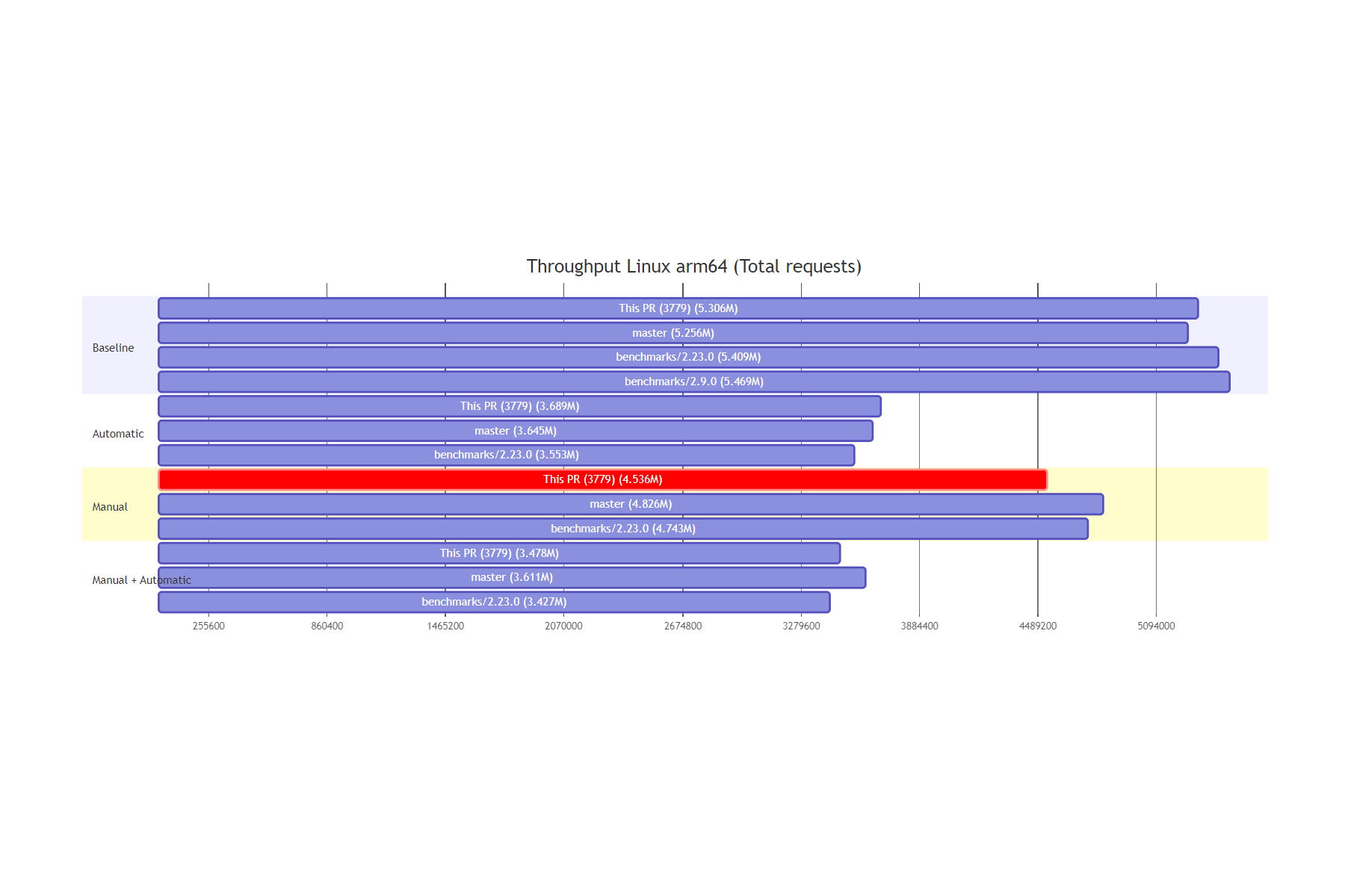
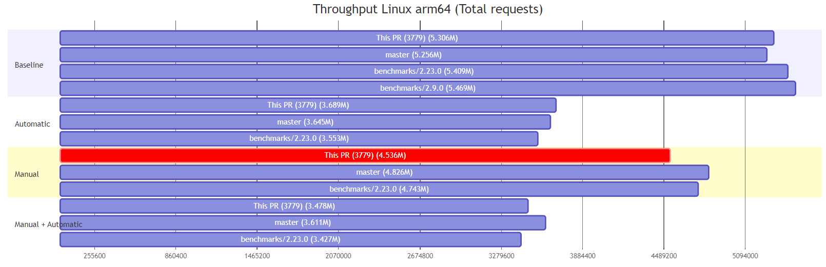
Putting it all together, means we can create a chart that looks like the following:
```mermaid
gantt
    title Throughput Linux x64 (Total requests)
    todayMarker off
    dateFormat  X
    axisFormat %s

    section Baseline
    This PR (3781) (6.170M)   : 0, 6170460
    master (5.970M)   : 0, 5969974
    benchmarks/2.23.0 (6.211M)   : 0, 6211402
    benchmarks/2.9.0 (6.225M)   : 0, 6224510

    section Automatic
    This PR (3781) (4.134M)   : 0, 4134494
    master (4.235M)   : 0, 4235043
    benchmarks/2.23.0 (4.255M)   : 0, 4254809
    benchmarks/2.9.0 (4.389M)   : 0, 4388983

    section Manual
    This PR (3781) (5.199M)   : 0, 5199286
    master (5.335M)   : 0, 5335475
    benchmarks/2.23.0 (5.464M)   : 0, 5464474

    section Manual + Automatic
    This PR (3781) (3.922M)   : 0, 3921636
    master (4.023M)   : 0, 4023108
    benchmarks/2.23.0 (4.095M)   : 0, 4094835
```
Which, when rendered, looks something like this:
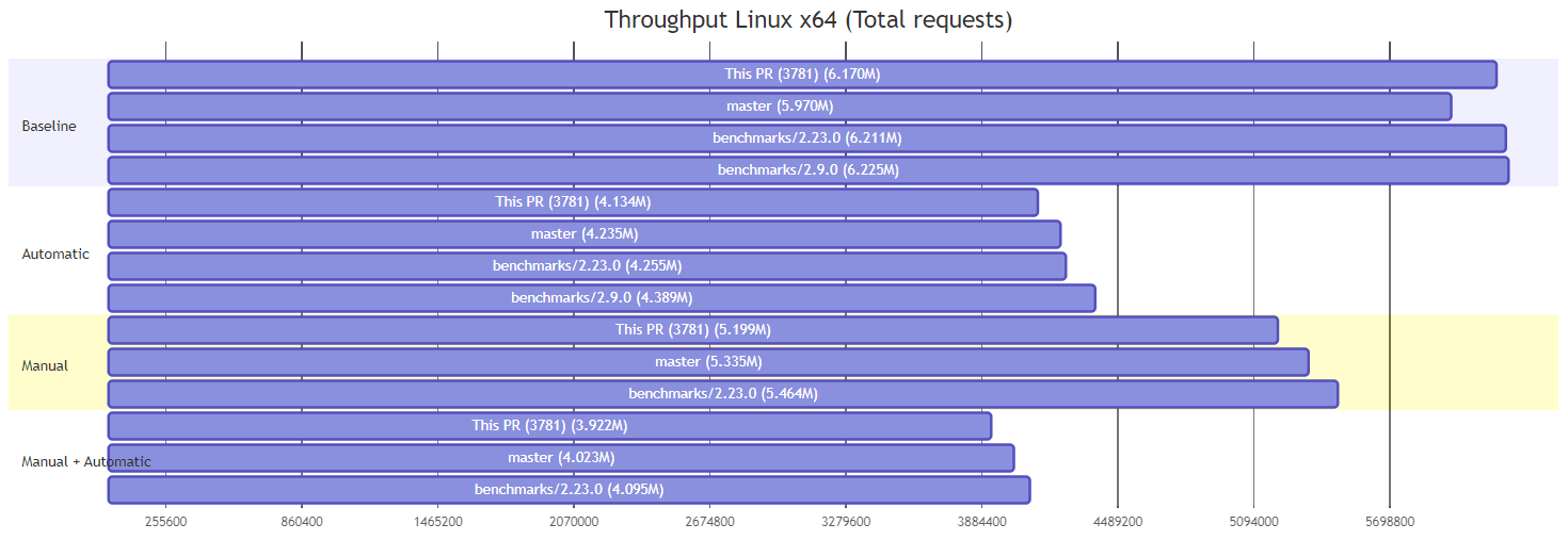
Each bar is defined using the format
<BranchName> : 0, <Value>
The 0 specifies the start-point of the bar, which obviously we want to all start at the same point. the <Value> is the number of requests, and is used for the "duration" of the element, creating the bars.
The rendering obviously isn't perfect (more on that later) but overall it does a decent enough job of showing a "single value" for the bar.
As a bonus, we can also automatically highlight concerning results, by marking the element as critical:
<BranchName> : crit, 0, <Value>
This prints the bar in red, and makes it easy to spot potentially problematic values at a glance:
Hacking mermaid diagrams to produce box-plots
As well as the "bar chart" for throughput tests, I also wanted to draw something akin to a box-and-whisker plot for our execution time tests. I experimented with various options but the best I could come up with is shown below:
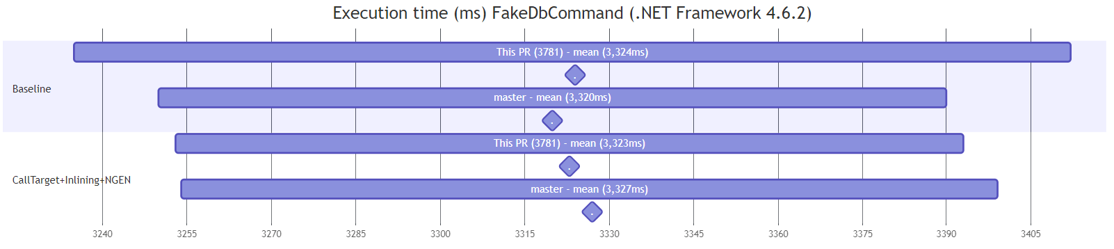
This chart shows the 99% confidence interval for the values, based on the mean and standard deviation of the results. The mean value is shown as a diamond below the graph. This is obviously a fair way from showing all the detail that you get in a box-and-whisker but it's the best option I could find 🤷♂️
The main difference with these plots from the bar chart are that instead of starting from 0, the elements define the lower and upper bound for the bar using
<BranchName> : <Lower>, <Upper>
The diamond for the "mean" is created using a milestone marker, with an empty name (or . anyway, as you must provide some sort of name):
. : milestone, <Mean>,
When you put it all together, you end up with something like this (which created the above diagram):
```mermaid
gantt
    title Execution time (ms) FakeDbCommand (.NET Framework 4.6.2)
    todayMarker off
    dateFormat  X
    axisFormat %

    section Baseline
    This PR (3781) - mean (3,324ms)  : 3235, 3412
     .   : milestone, 3324,
    master - mean (3,320ms)  : 3250, 3390
     .   : milestone, 3320,

    section CallTarget+Inlining+NGEN
    This PR (3781) - mean (3,323ms)  : 3253, 3393
     .   : milestone, 3323,
    master - mean (3,327ms)  : 3254, 3399
     .   : milestone, 3327,
```
As with the bar charts, we can mark problematic results in red using crit.
Of course, it's buggy
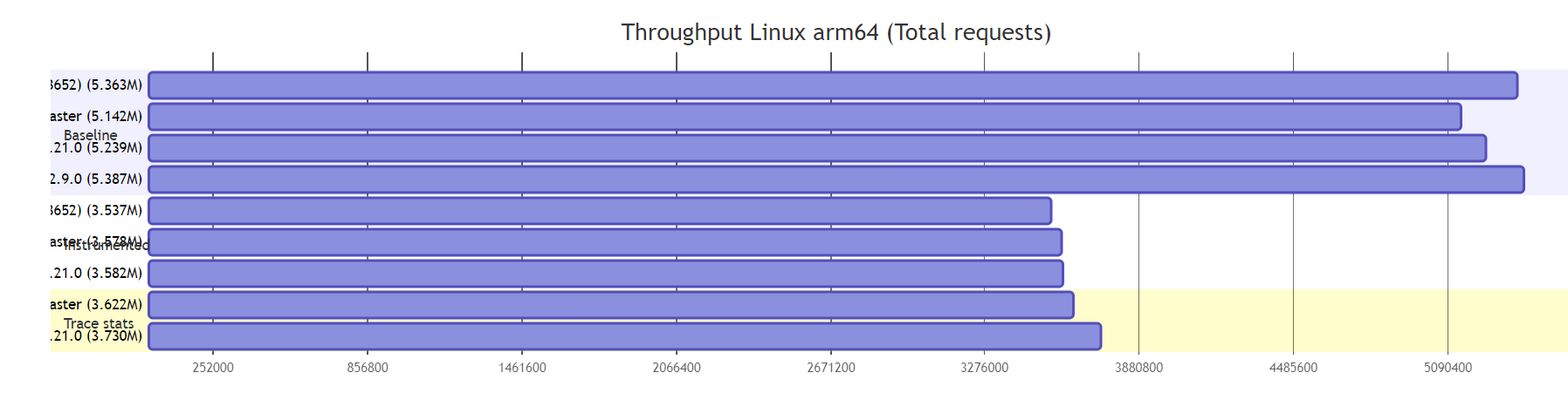
And now we come to the down sides. Even if you exclude the limited features and options available when hacking gantt charts like this, the results are slightly frustratingly buggy. As far as I can tell, these bugs lie either in the mermaid.js library itself, or in the way GitHub uses it, but I haven't looked into the issues any further than that.
First of all, there's the layout issues. In the above diagrams, the longer section labels overlap the bars. That's a bit annoying, but I couldn't see an easy way of fixing it automatically.
Secondly, the axis displays in annoyingly random units. They're not random, but it sure looks like it, and I couldn't get the tickInterval to work as I wanted (just put ticks on round numbers, please!). This one is probably on me, but I gave up with it.
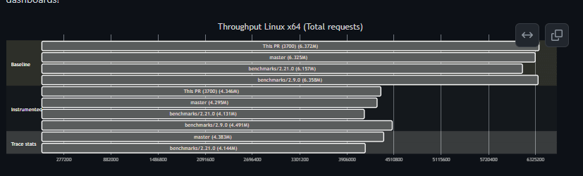
Now we get to the more problematic issues. First of all: scaling. If you have your monitor to set to anything other than 100%, things go a bit wonky. Notice how the labels for each bar are no longer on the bar? Instead they're shunted all the way to the left, making them pretty useless.
Another tiny one is that the dark mode version just looks a bit harder to read IMO:
And if you try to use done (in addition to crit) as another way of highlighting graphs, then it gets impossible to read in dark mode!
Still, overall, it's a relatively simple way to get a few graphics into our PR comments with pretty low difficulty!
Summary
In this post I showed how I added graphs to GitHub PR comments by abusing mermaid diagram Gantt charts. I showed two different types of graphs (bar chart and box-plots) that you can create, albeit with a number of limitations. It's certainly not a high-fidelity or brilliant solution, but it gets the job done for the few charts we need to display!